When Total Communication Therapy (TCT) came to us, they were a small, local speech-language pathology (SLP) practice with no clear brand identity. Their positioning was vague—offering generic “SLP solutions”—and their primary growth efforts revolved around securing school contracts. Despite genuine expertise and care, they were virtually indistinguishable from countless other clinics.
They weren’t struggling due to lack of skill, but because no one understood what made them different—or why it mattered. Their brand failed to communicate their value, and more importantly, failed to connect with the people they were best positioned to help.
.gif)


We redefined their strategic foundation by shifting the focus from institutions (like schools) to parents—specifically, those feeling overwhelmed by their child’s slow or stagnant therapy progress.
Their new positioning centered on empowerment, clarity, and at-home transformation:
“We help parents of children with speech delays who feel overwhelmed and frustrated by slow therapy progress to confidently support their child every day. Unlike traditional clinics that rely on short weekly sessions, our solution gives them a custom plan and real SLP guidance—so speech progress happens at home, consistently and faster.”
This strategic reframing allowed the brand to move out of the noise of generic SLP services and carve out a differentiated, parent-first narrative. The founder gained new clarity on their core promise and voice—and finally had a way to communicate their expertise in a way that felt both compelling and aligned.
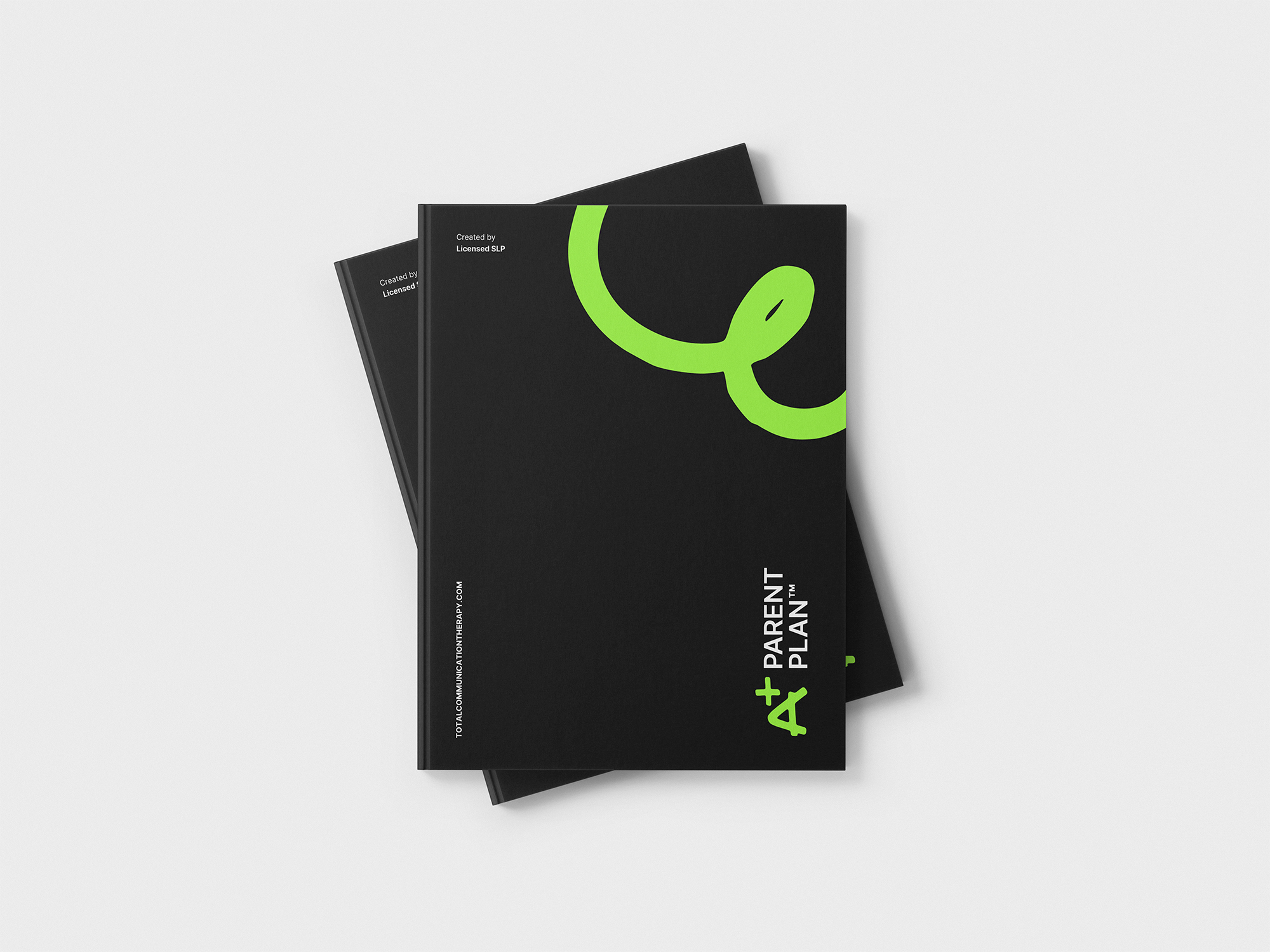
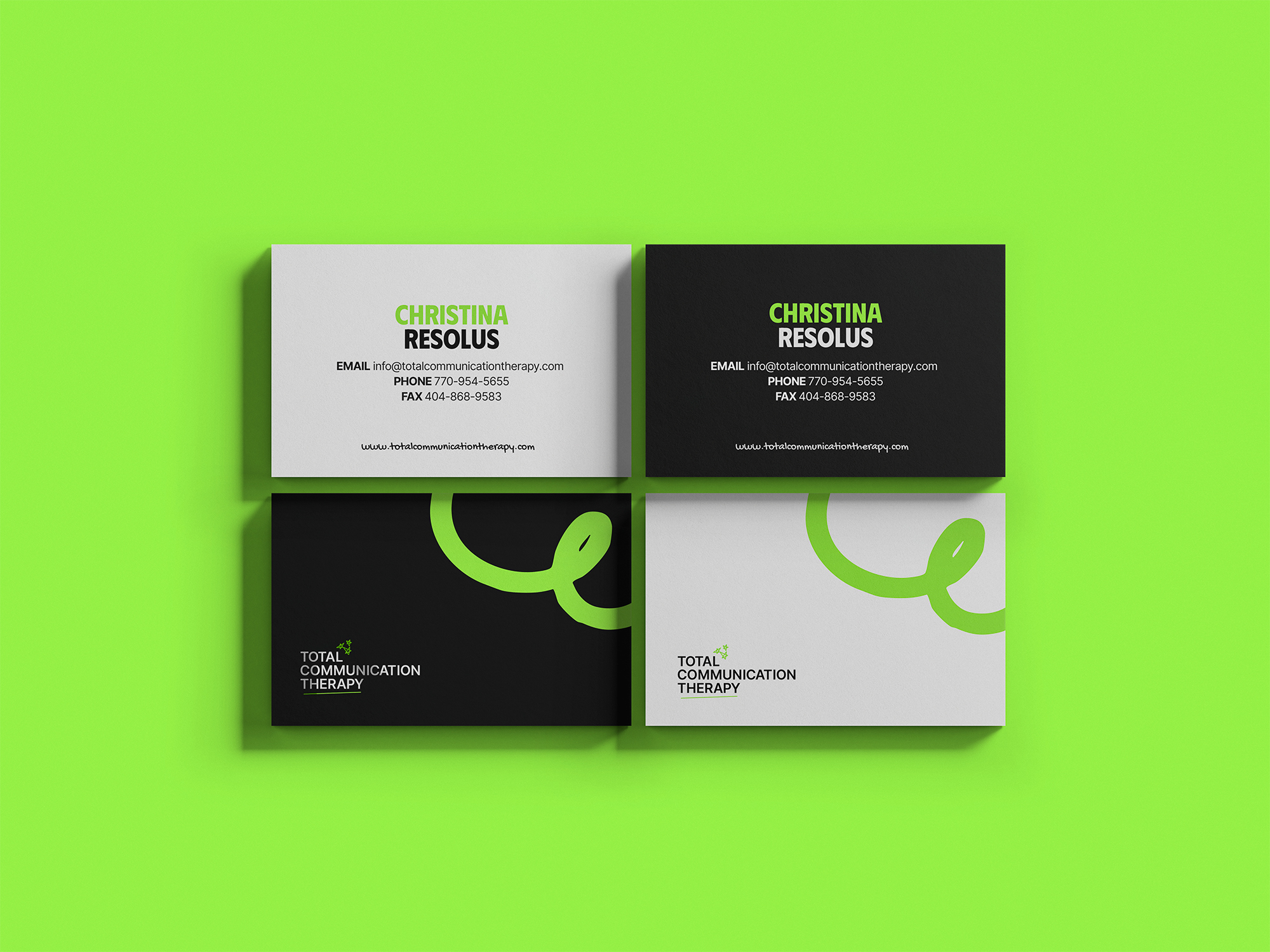
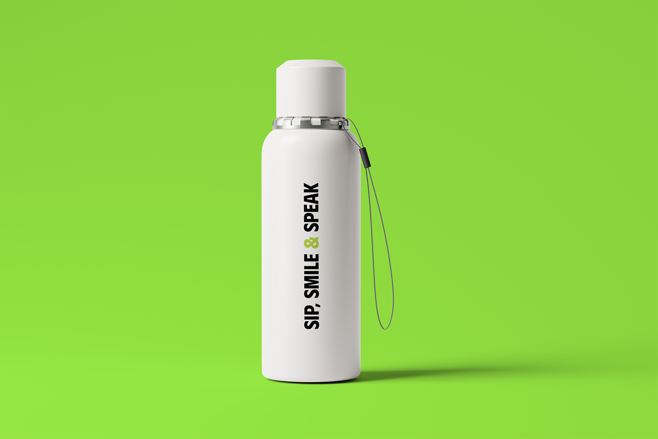
The visual overhaul was driven by a desire to reflect confidence, intelligence, and warmth—without defaulting to the “soft pastels and childlike fonts” typical in the therapy space.
We replaced their outdated Canva-style identity with a bold, editorial system. The new wordmark-driven logo introduced hand-drawn doodle elements—subtle, flexible visuals that added personality and evoked structure, support, and learning. This allowed the brand to feel friendly and approachable without compromising professionalism.
The new visual system incorporated a high-contrast color palette, clear editorial typography, and tactile graphic elements. Every brand touchpoint—from lead magnets to parent guides to digital forms—was redesigned to feel cohesive, modern, and credible. The result was a system built for growth: one that could scale into digital products, content, and thought leadership—without losing the emotional resonance parents needed.
With their rebrand, TCT evolved from a generic SLP clinic into a high-conviction, parent-first brand with a scalable growth engine.