Kindred Running came to us ahead of their launch with a bold vision—but no clear articulation of it. What began as a small, community-led run club was quickly evolving into something much bigger: a retail space, a social hub, and a platform for personalized running solutions.
But without strategic positioning, they risked being perceived as just another local shop—or just another group run. The challenge was clear: How do you introduce a brand that defies category expectations… and make it feel instantly essential?
We worked closely with the founders to define what Kindred really offered: a custom-fit running experience powered by tech, community, and care.
Rather than positioning them as a store or a club, we clarified their unique mechanism—an ecosystem that blends:
Together, these elements became the brand promise: Run Better. Belong Deeper.
A tagline that reflects both physical transformation and emotional connection—delivered in a way only Kindred could.


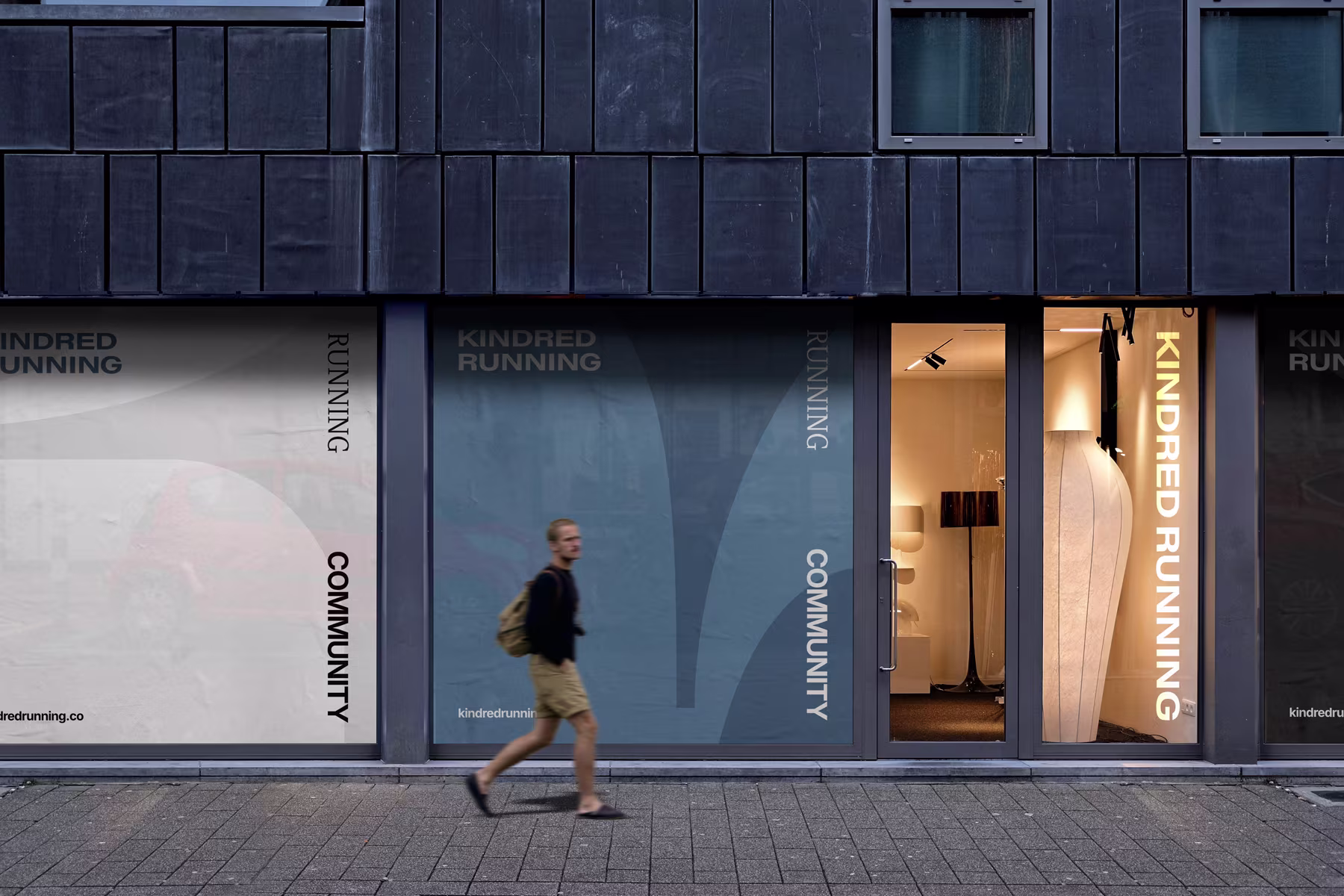
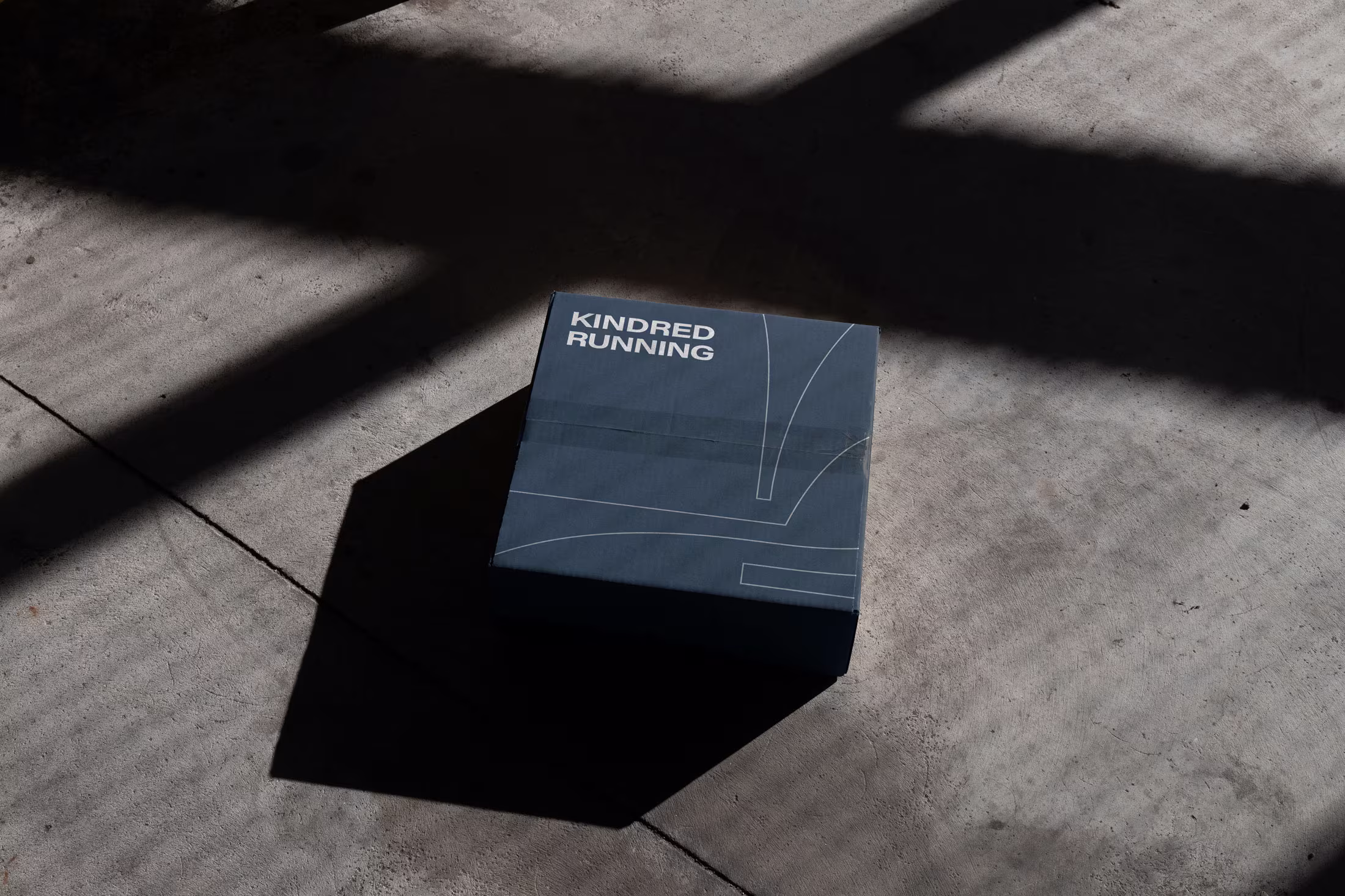
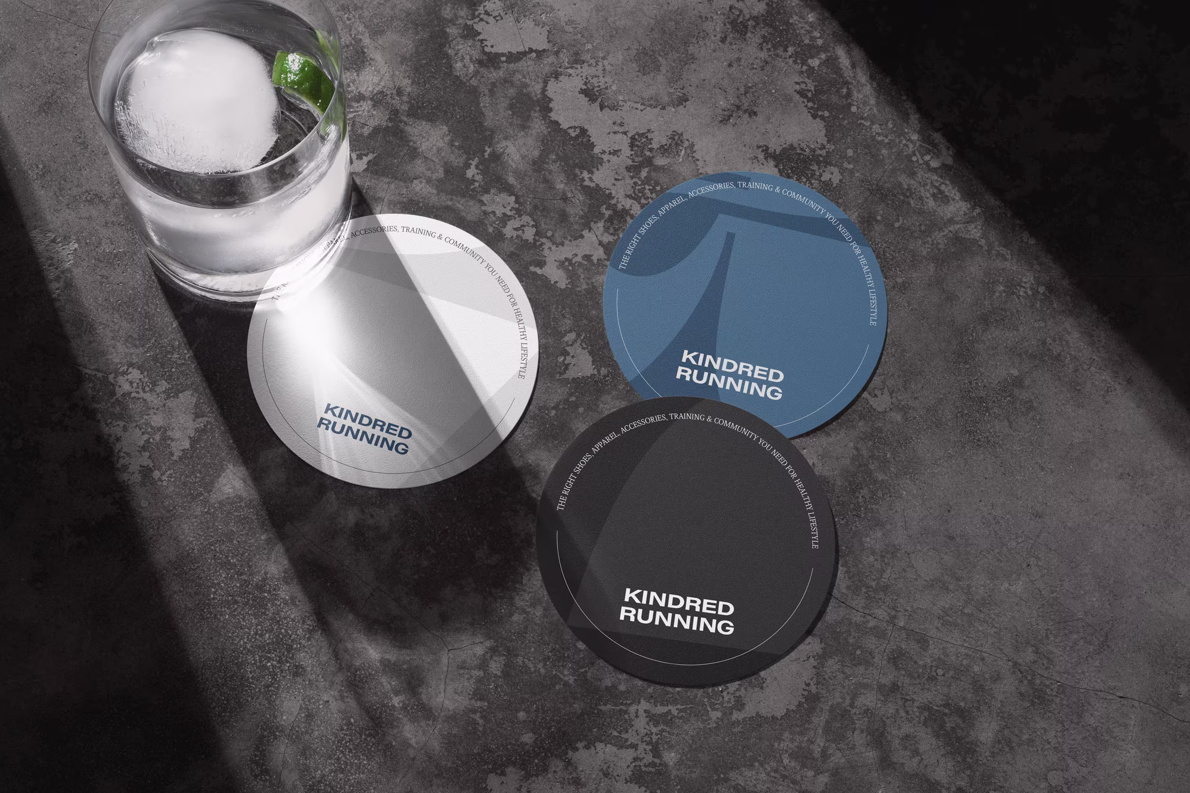
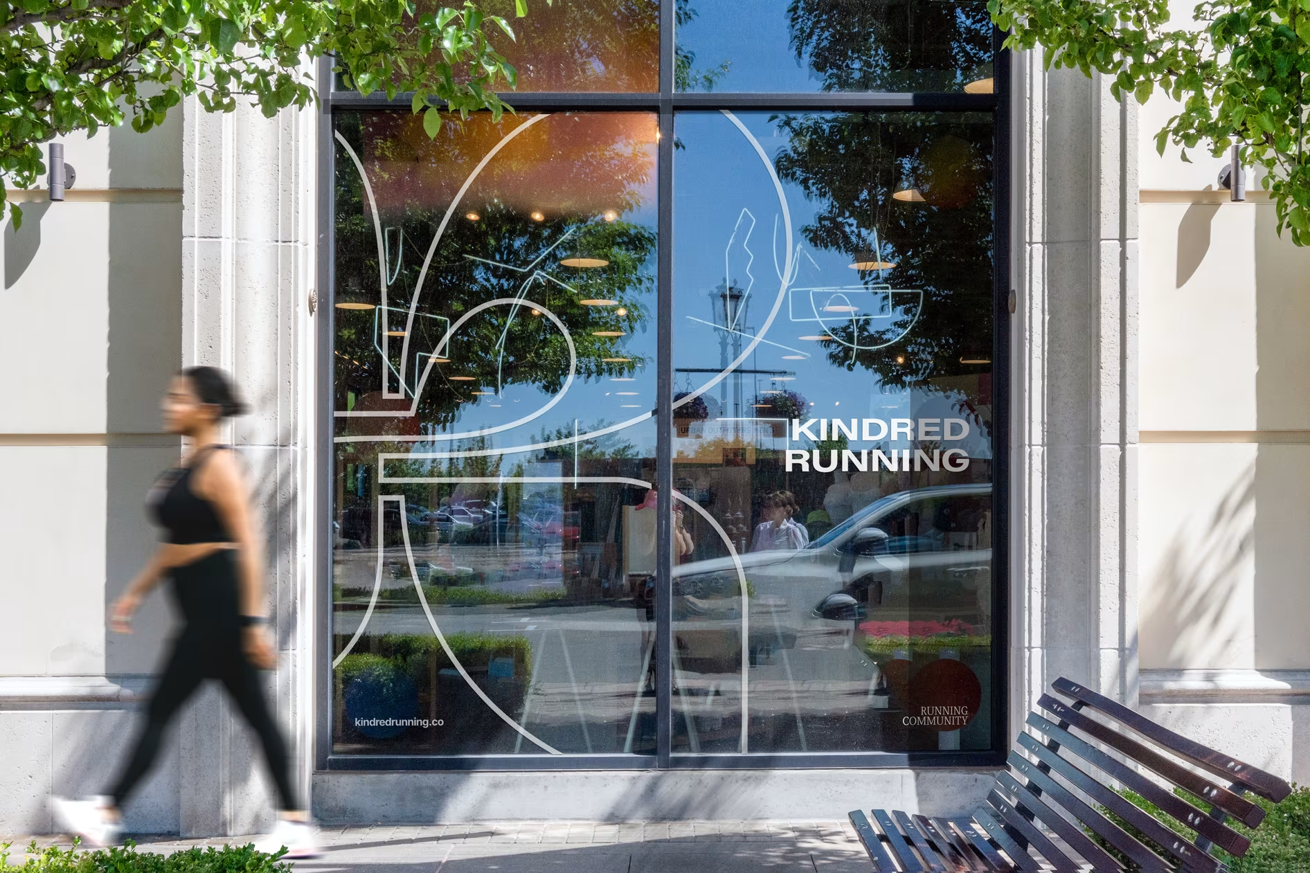
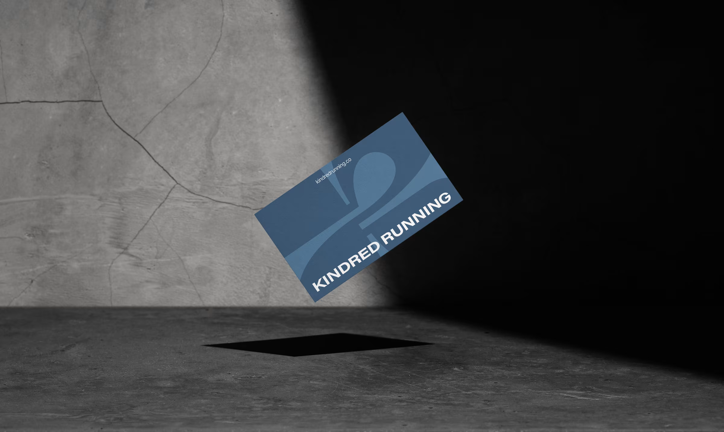
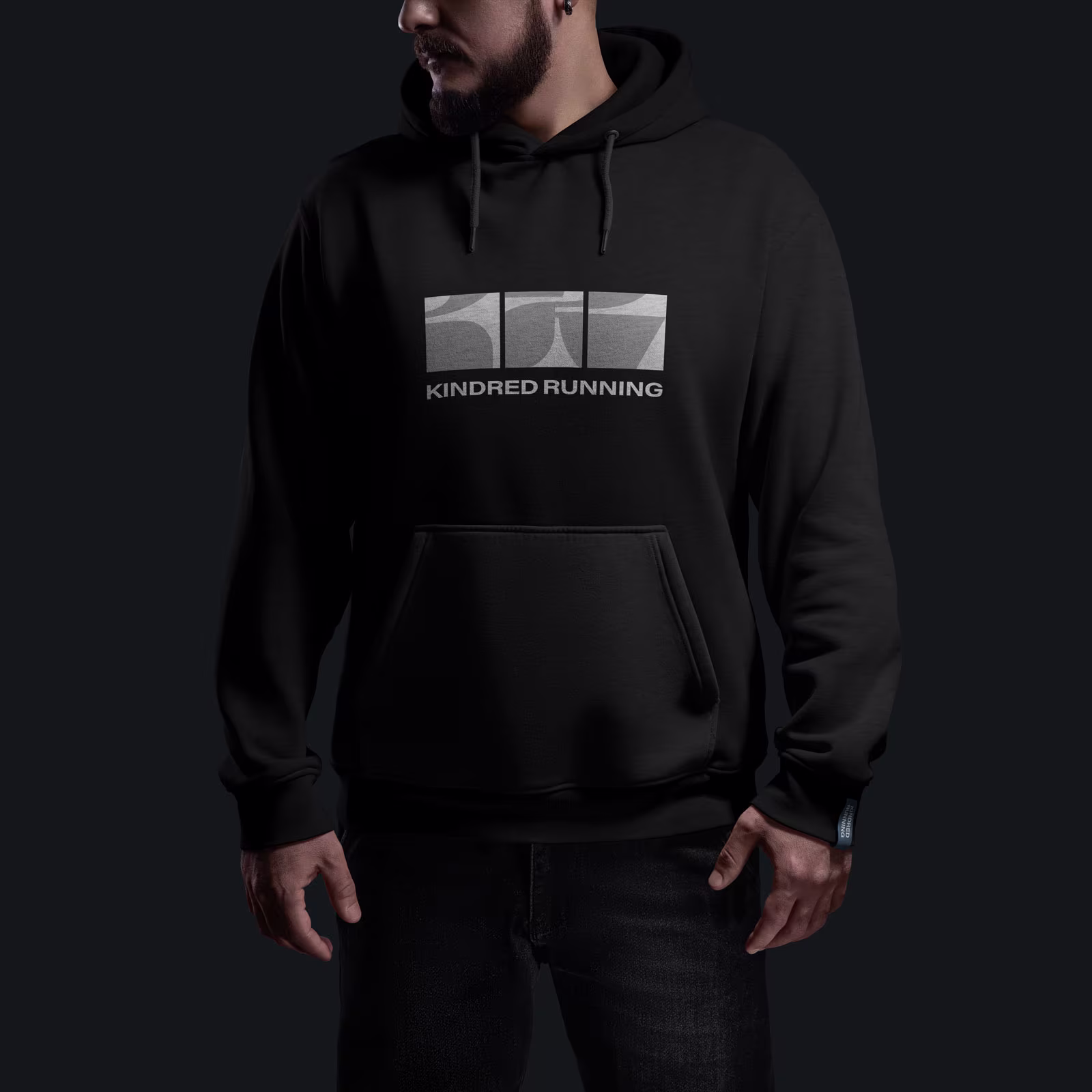
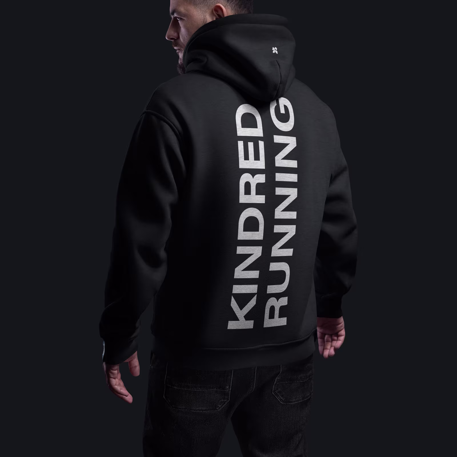
The visual identity system we built captures Kindred’s blend of modern performance and lifestyle depth. Rooted in a mid-century modern meets Americana aesthetic, the brand feels bold but warm, functional but stylish.
The custom logomark merges the initials “K + R” using four modular shapes—representing movement, individuality, lifestyle, and community. Together, they form a blooming symbol of personal growth and shared progress.
Editorial typography, warm neutrals, and layout systems inspired by neighborhood record shops and bookstores gave the brand a sense of place and culture. We extended the identity across storefront signage, branded merch, event assets, environmental design, and launch activations—ensuring every touchpoint felt connected and intentional.
With a brand system that matched the emotional and physical rhythm of their community, Kindred Running successfully launched with a clearly differentiated brand and market-ready ecosystem: