Phinity Therapy approached us as a brand-new private clinic preparing to enter the competitive UK mental health space. With no name, no brand system, and no market presence, they needed a full foundation for launch—something that would feel trustworthy, intelligent, and professional, but still accessible and warm for a global client base.
The challenge was to build a distinctive identity from scratch—one that conveyed clarity and confidence in a saturated wellness market, while feeling emotionally safe, creative, and reflective of their unique approach to therapy.

Phinity Therapy wasn’t built to serve the masses—it was created for clients seeking emotional clarity, not quick fixes. We positioned the brand to speak directly to high-functioning adults navigating internal complexity, reframing therapy not as a crisis tool, but as a long-term partnership in self-alignment.
Their core messaging became clear:
Phinity helps high-functioning adults navigate inner complexity with emotional precision—guiding them not toward reinvention, but alignment.
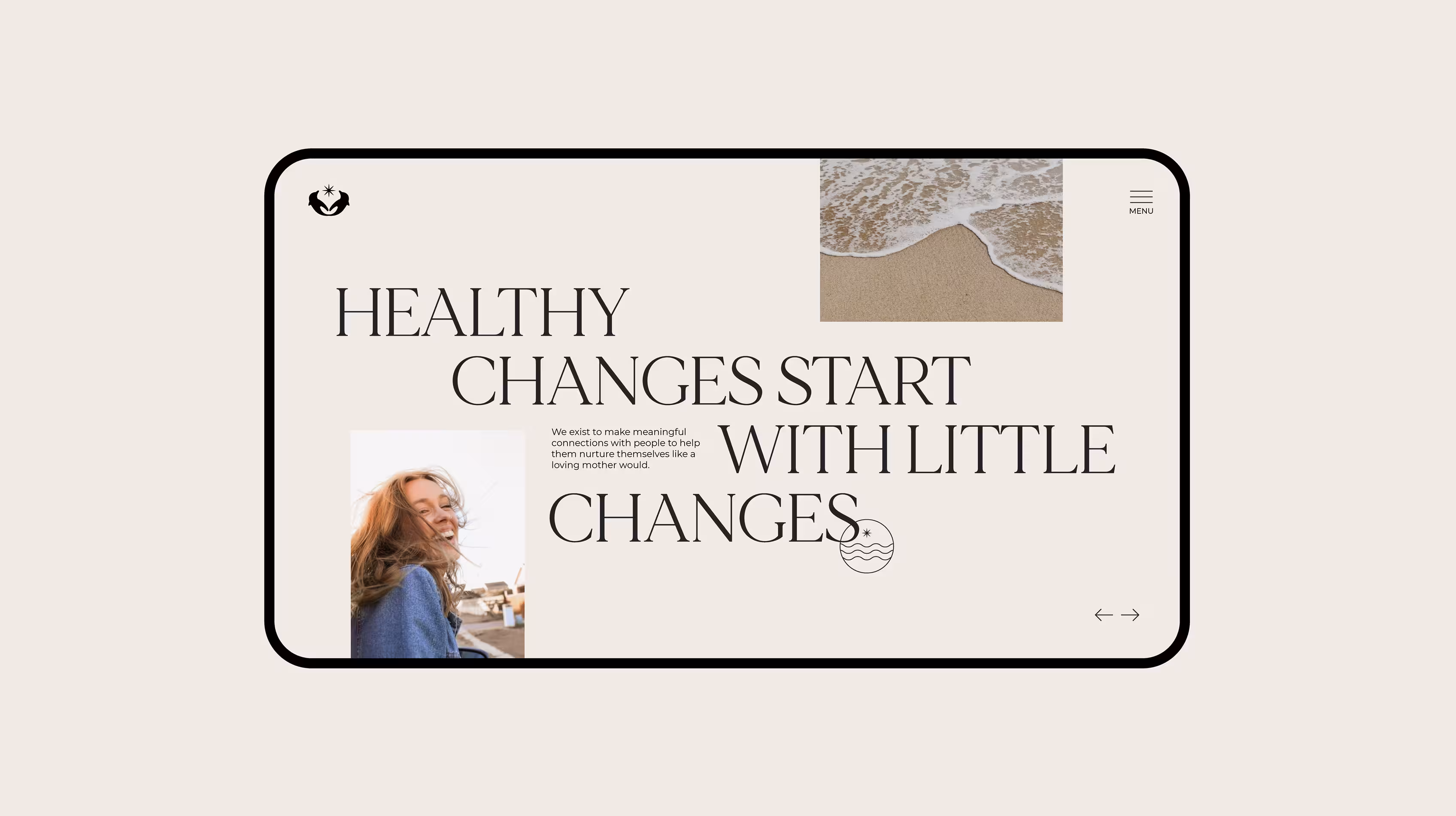
This narrative allowed Phinity to confidently step outside the overly soft or clinical tone often found in the therapy space. Instead, we anchored the brand in emotional intelligence, grounded professionalism, and intentional warmth—qualities reflected in their team’s approach.
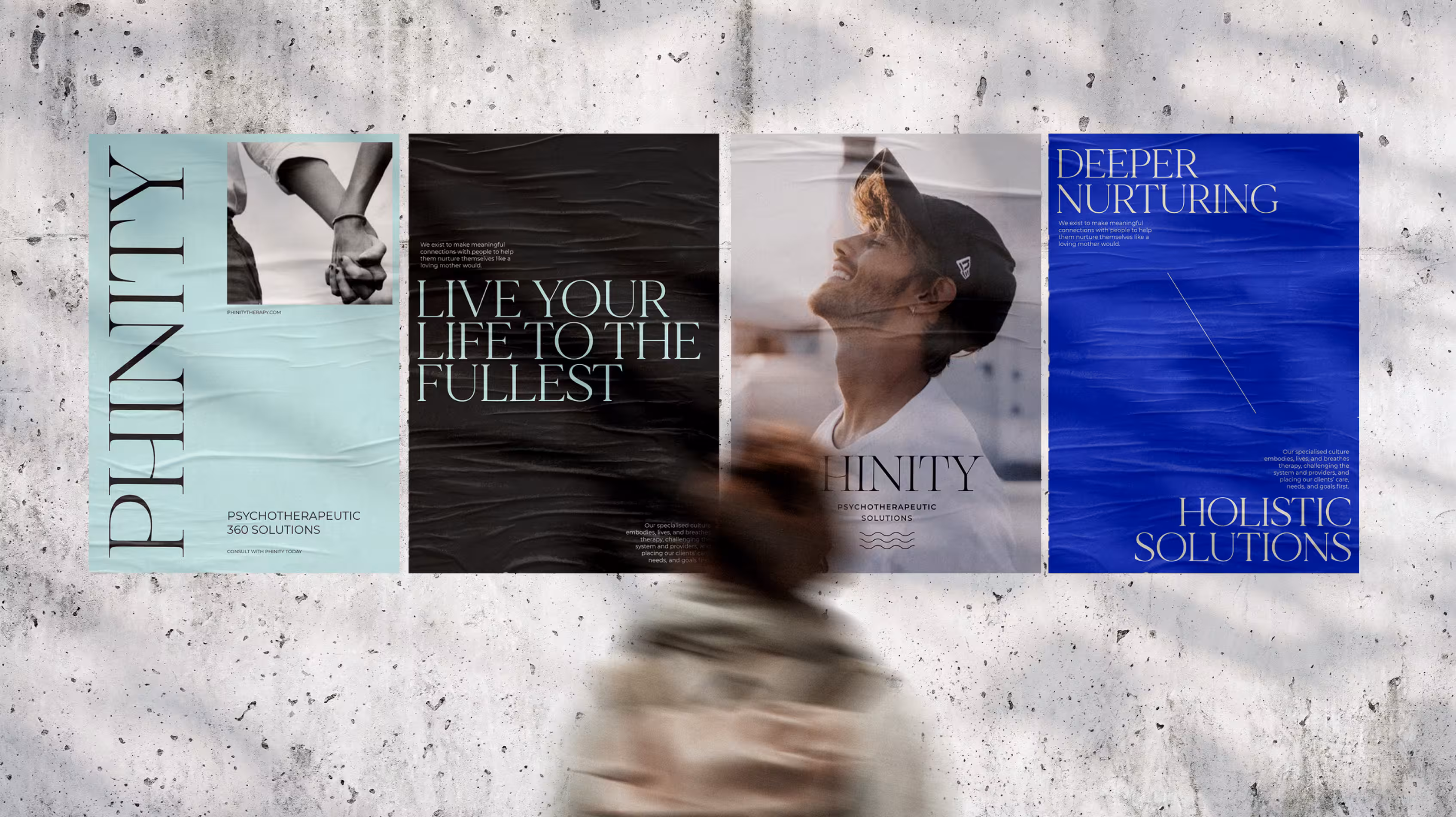
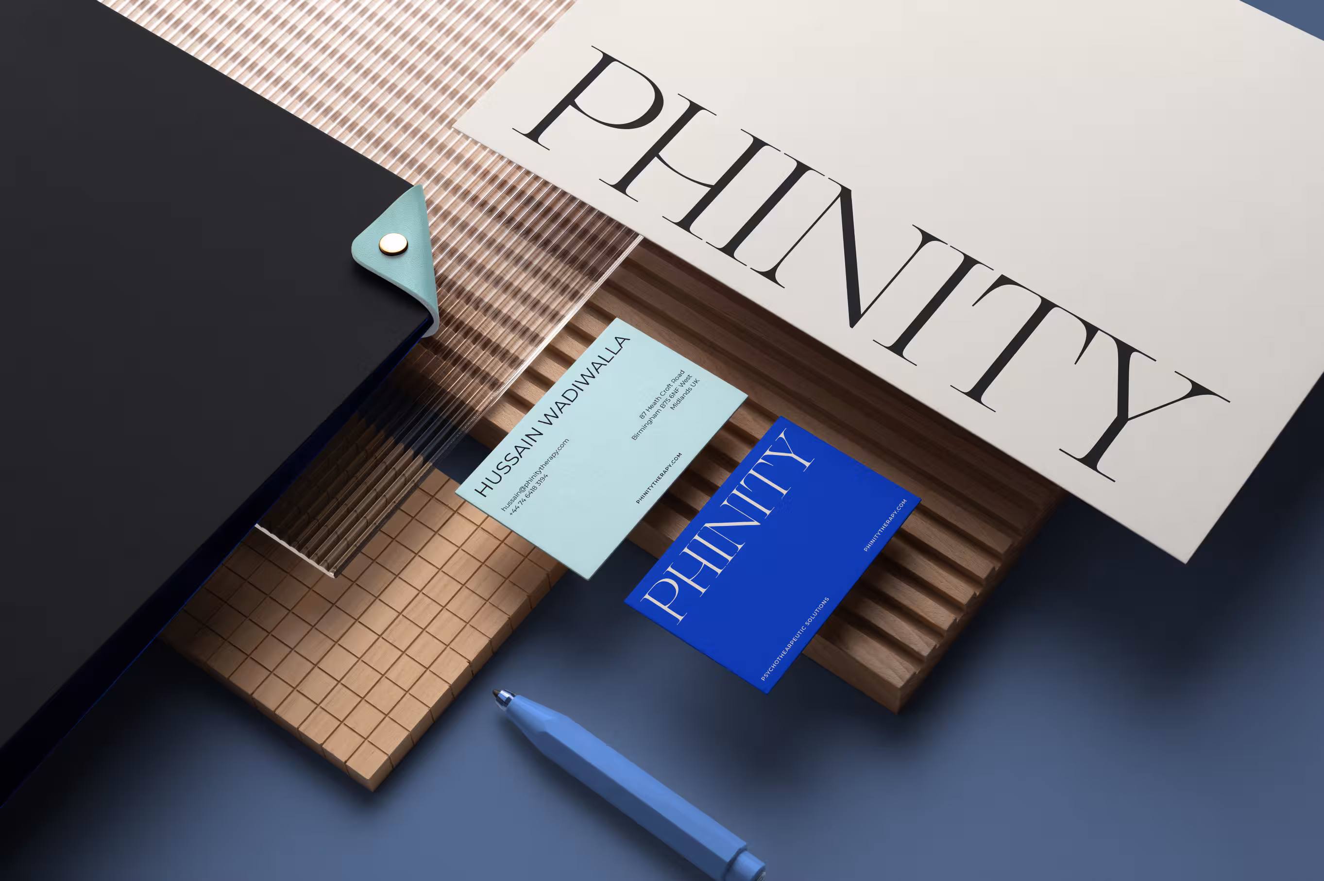
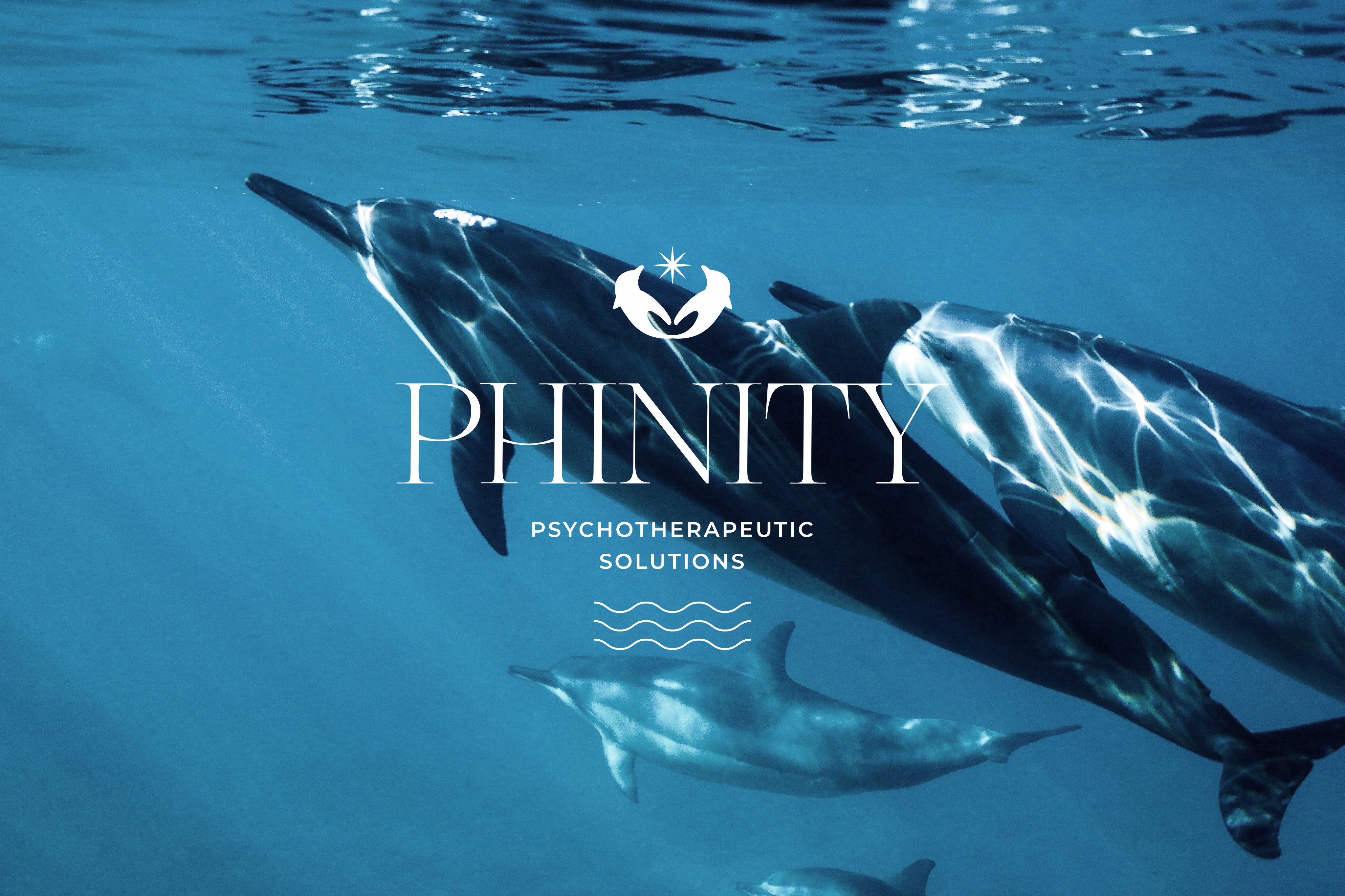
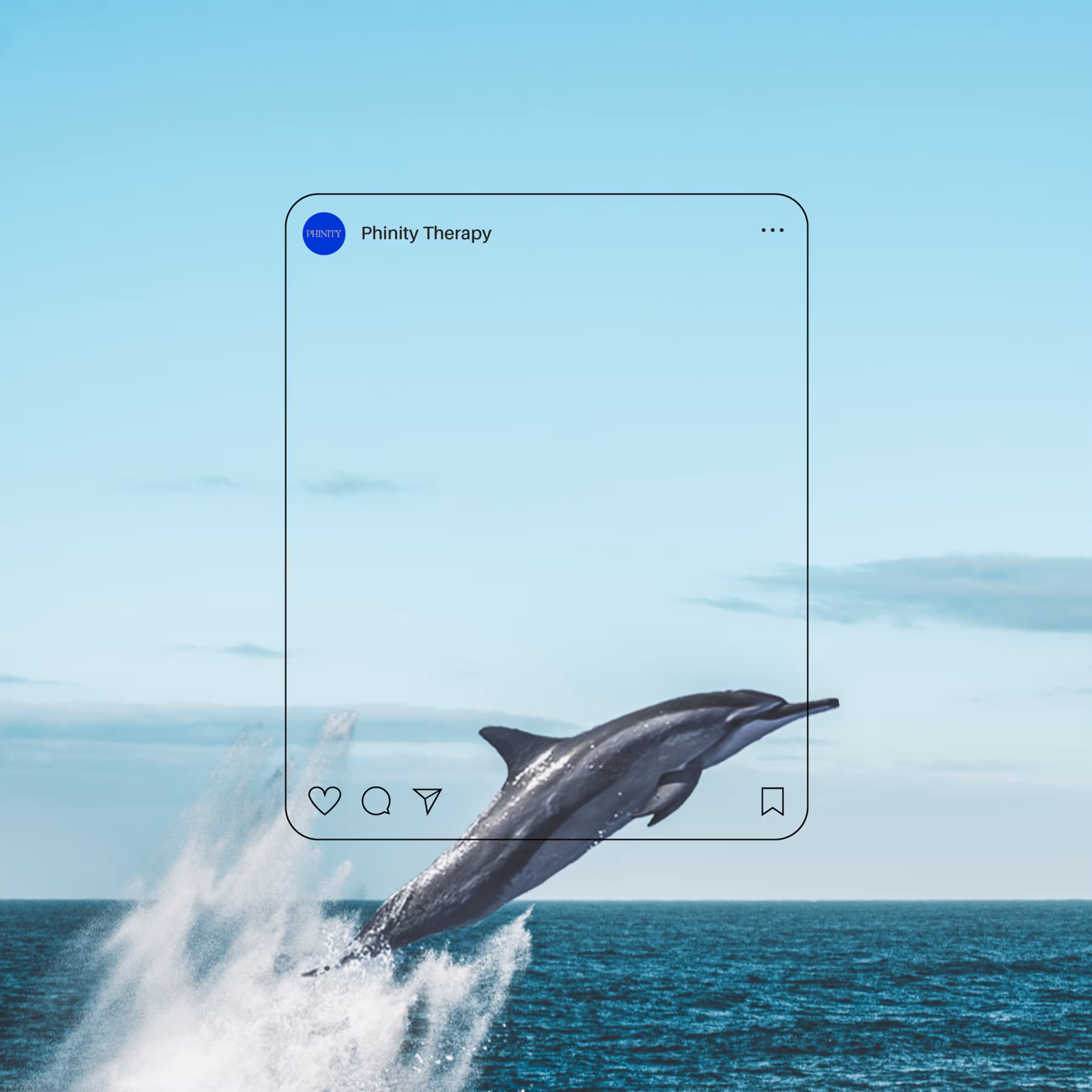
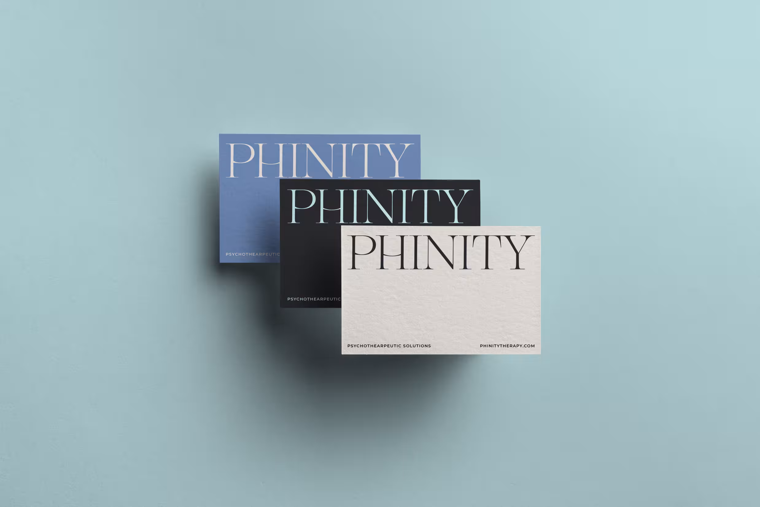
To name the brand, we explored symbolism aligned with their values. The dolphin—graceful, relational, curious, and highly intelligent—became a guiding metaphor. From this, we coined “Phinity”: a fusion of phin (from dolphin) and affinity, capturing both intuitive connection and emotional depth. It was elegant, fresh, and differentiated—just like the brand.
Through this clarity, Phinity positioned itself not as a rescue service, but as a reflective space for meaningful, internal transformation—led by practitioners who value structure, curiosity, and calm authority.
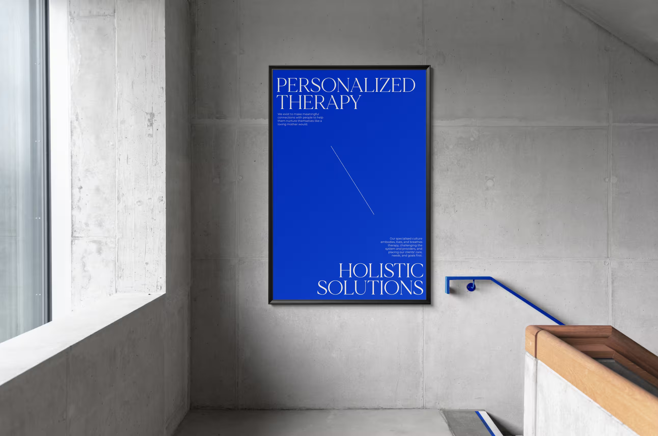
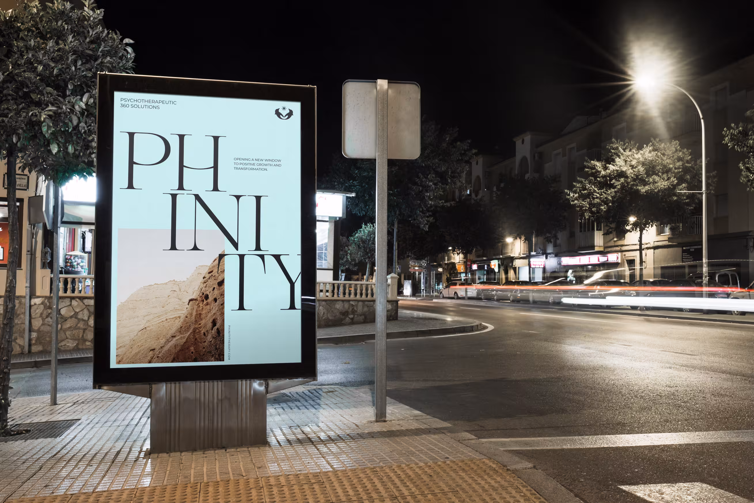
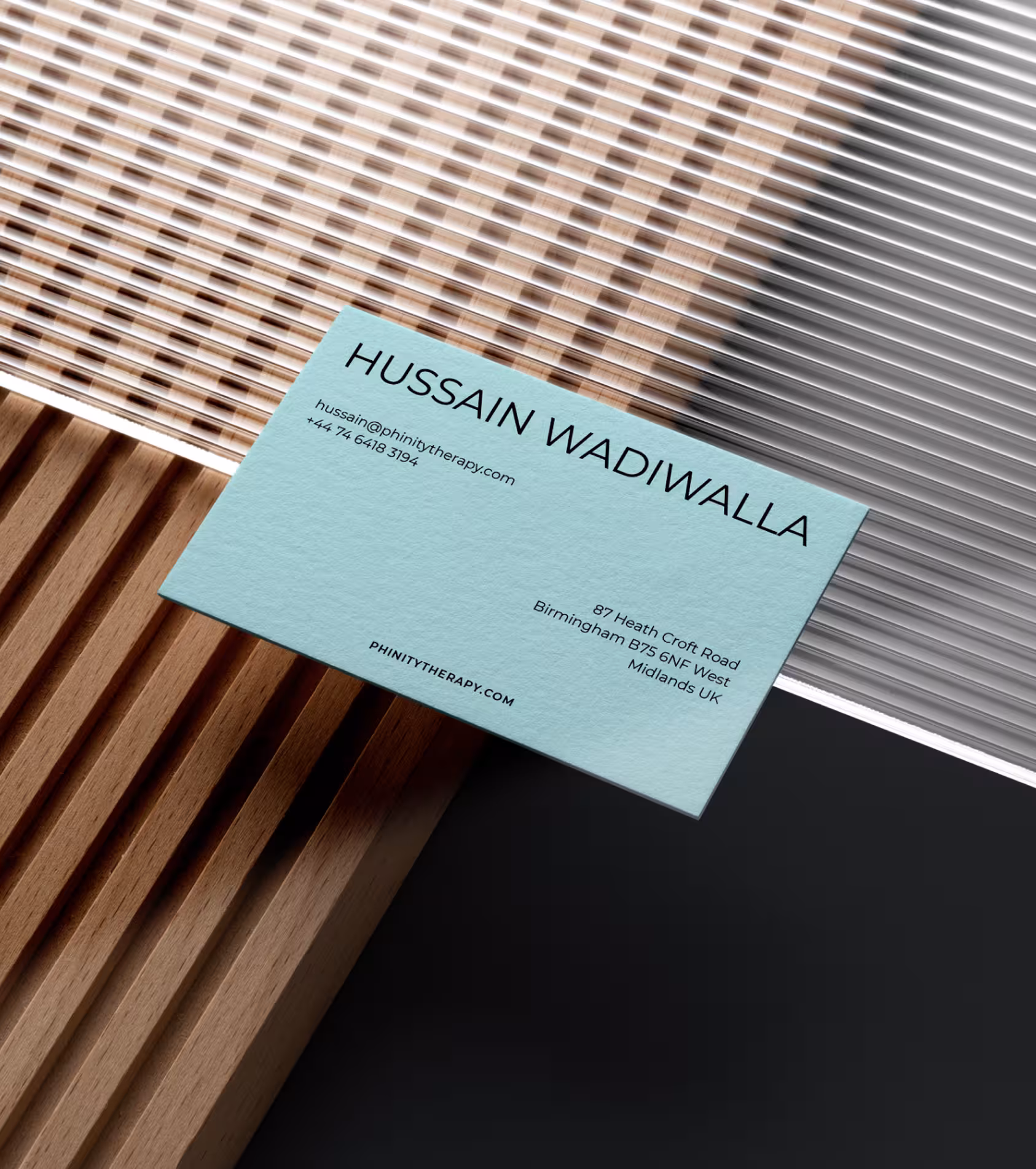
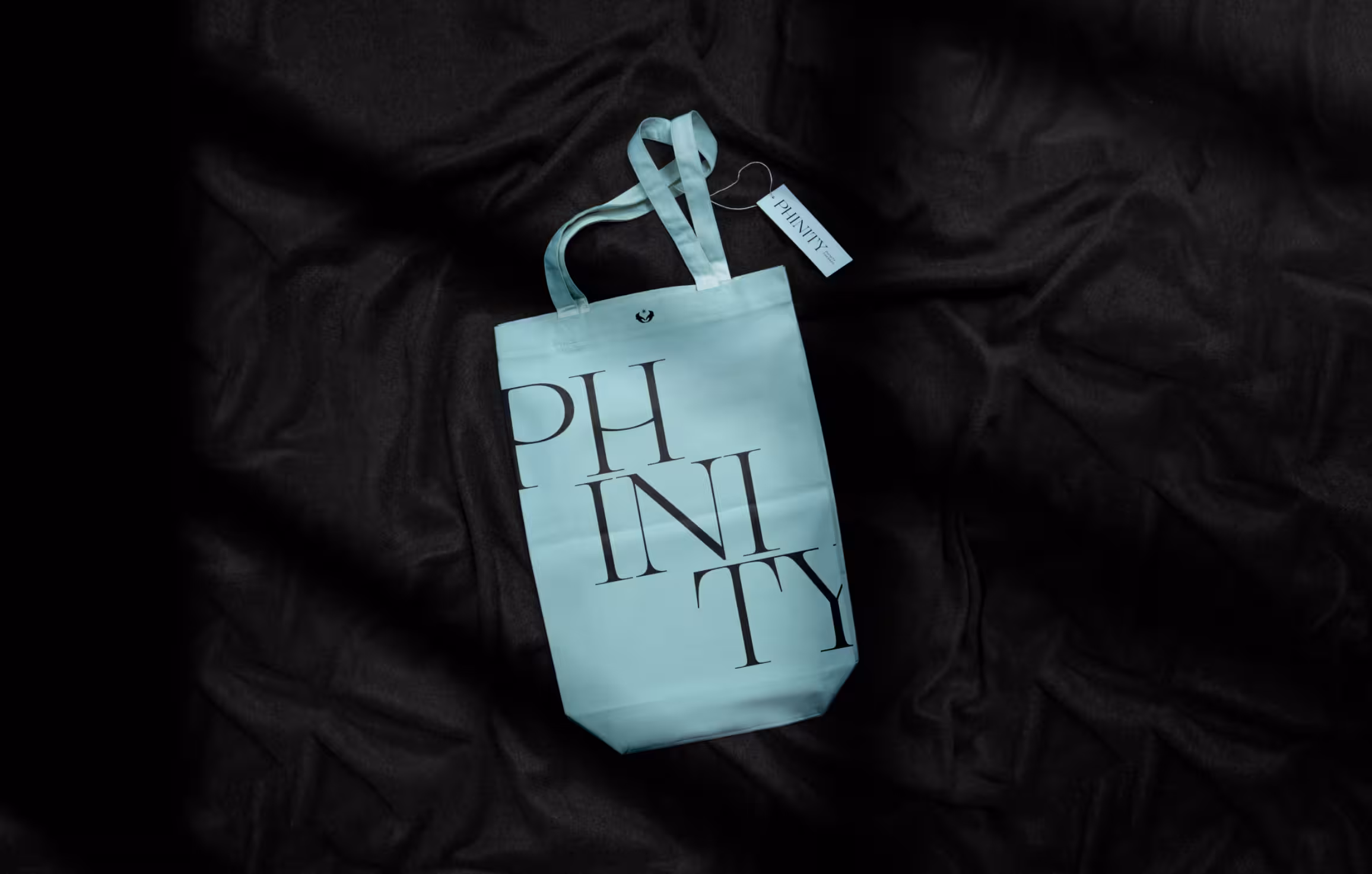
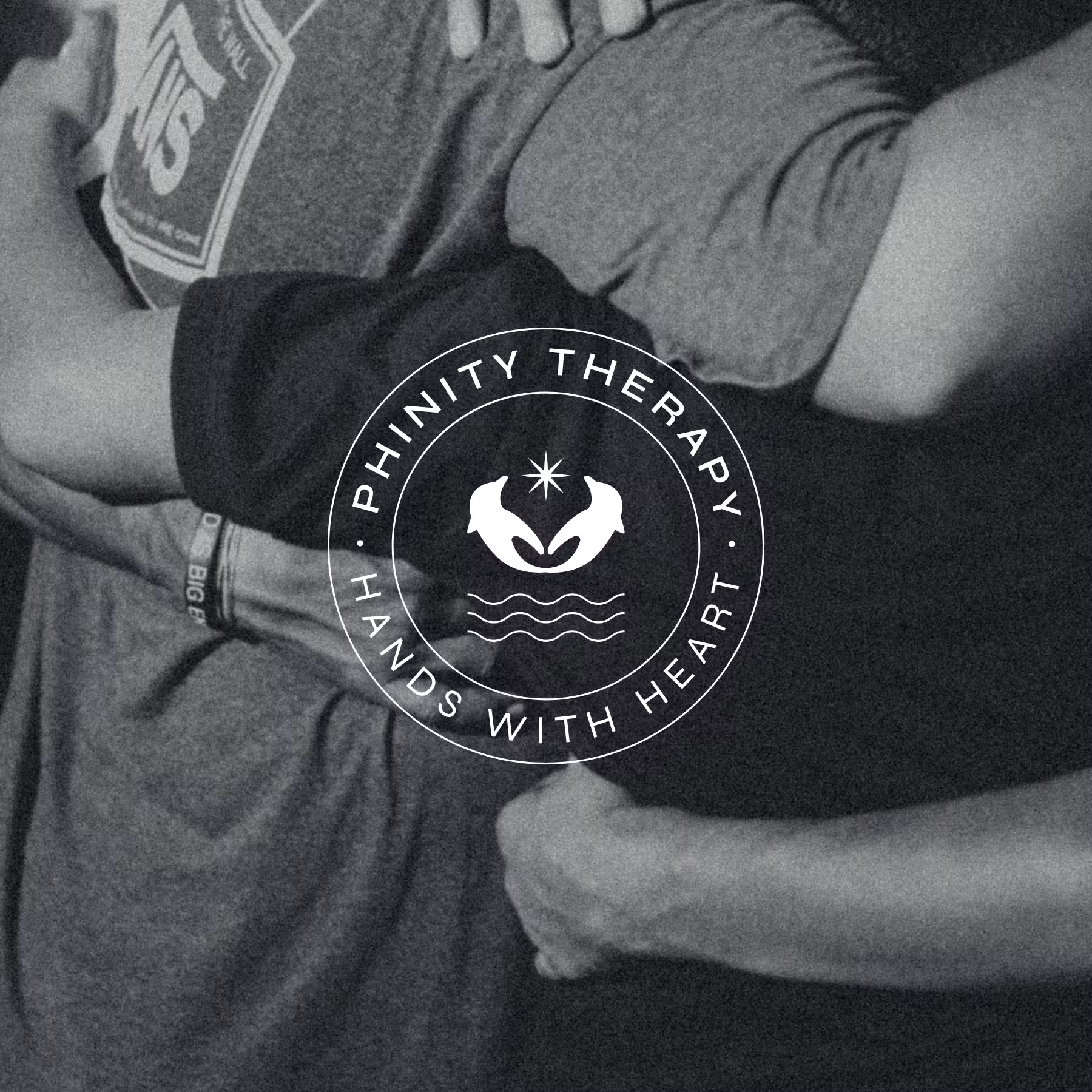
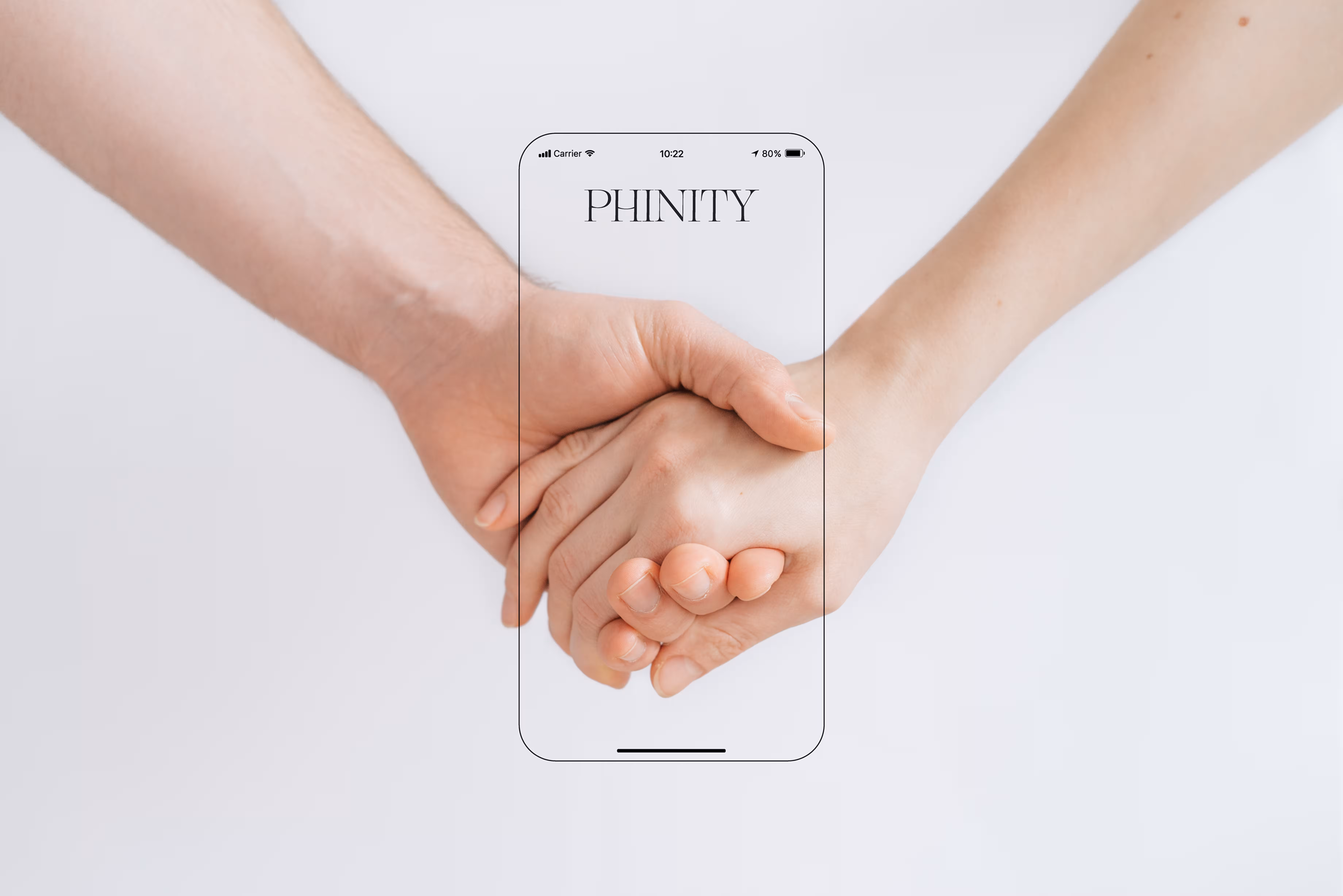
Phinity’s visual identity strikes a balance between emotional intelligence, structure, and human-first philosophy. The mark integrates dolphins (grace, intelligence, connection), hands forming a heart (care and support), and a triple wave symbolizing their core archetypes—leader, nurturer, and explorer. We designed a system where even the wordmark alone could serve as a flexible, confident design base. Variations allowed for elegant layout play while maintaining consistency. The refined palette and typography moved away from clinical or overly soft aesthetics—resulting in a brand that feels grounded, modern, and distinct.
Phinity launched with a distinctive presence that immediately set them apart from typical therapy clinics.