ICOI, the International Congress of Oral Implantologists, came to us at a pivotal crossroads. As the world’s largest dental implant organization, with over 25,000 members in 90+ countries, they had built decades of academic credibility and global influence. But with an increasingly saturated market and shifting generational expectations, their brand was losing relevance.
Their challenge wasn’t reputation—it was resonance.
Younger practitioners, tech-forward professionals, and international members didn’t see themselves reflected in the outdated brand. At the same time, any change risked alienating the established clinicians, researchers, and educators who had built ICOI’s legacy. They needed a modern, global identity that could unify these audiences—and reposition ICOI as the essential connector between tradition and innovation.

We repositioned ICOI as a bridge between what’s proven and what’s possible. Rather than abandoning its heritage, the new strategy framed ICOI as the only global platform where timeless knowledge meets the cutting edge of dental innovation.
The brand strategy clarified its core role: "Empowering oral implantologists to advance their expertise, elevate their careers, and expand the future of dentistry—together." This repositioning shifted ICOI from a passive credentialing body to an active authority platform with global relevance.
We crafted language systems that honored their academic weight while introducing a fresh, inclusive, and future-facing tone—designed to resonate across cultures, generations, and specialties.
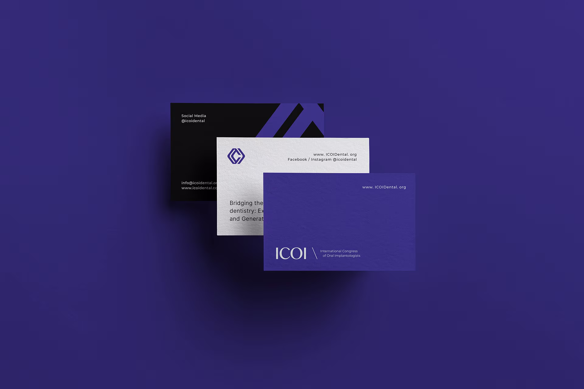
We developed a bold and elevated identity that signals forward motion while remaining grounded in credibility. The new logo features a dynamic mark built around interconnected circular forms—representing the ICOI’s global reach, cross-disciplinary collaboration, and continuous professional growth.
Color systems moved from clinical blue to a more sophisticated deep navy and gold pairing—establishing trust while elevating prestige. Typography combined modern geometric sans-serifs with refined editorial serif touches, reinforcing both structure and clarity.
Brand collateral—from conference signage to membership materials—was designed with consistency and hierarchy in mind, ensuring every touchpoint felt unified and globally scalable.
ICOI’s new brand identity repositions the organization as a central hub for next-generation dental leadership.